Business Card Size and Design Guide: What to Put on Your Card
The standard business card is 3.5 x 2 inches. See the bleed and safe zone, what to print and what to leave off, readable layouts, QR code tips and how to make a bilingual card.
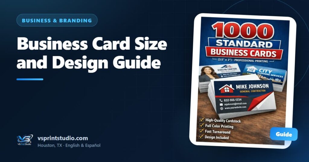
The short answer: a standard U.S. business card is 3.5 x 2 inches (about 8.9 x 5.1 cm). Build the artwork a little bigger, at 3.75 x 2.25 inches (1125 x 675 pixels at 300 DPI), so backgrounds can run past the cut, and keep every word and logo at least 0.125 inch inside the final edge.
That settles the business card size. This guide is for Houston business owners, freelancers and contractors ordering or redoing their cards, and it covers the rest: what to put on a card and what to leave off, how big the type should be, how to use the back, how to make a bilingual card and how to add a QR code that scans. You do not have to prepare the file yourself, but knowing the rules helps you judge the mockup we send you.
What is the standard business card size?
In the United States a standard business card is horizontal and measures 3.5 x 2 inches. Wallets, card holders and display stands are built around that size, so we recommend it unless you have a specific reason to change it. It is also the size of our 1000 standard business cards.
It helps to think in three measurements instead of one:
| Part of the file | Inches | Pixels at 300 DPI | What it does |
|---|---|---|---|
| Trim (the final card) | 3.5 x 2 | 1050 x 600 | The size of the card in your hand |
| Artwork with bleed | 3.75 x 2.25 | 1125 x 675 | The full file, including the strip that is cut off |
| Safe area | 3.25 x 1.75 | 975 x 525 | Where text, logo and QR code must stay |
Resolution matters more on a small card than most people expect. We recommend 300 DPI at the final size and treat 150 DPI as the minimum; below that, text and logos tend to look soft. A logo saved from a social media profile is usually too small and too compressed, so send the original file if you have it. Our print-ready artwork checklist covers formats and resolution for every product.
Cards from other countries often use slightly different sizes. If your design was made for one, send it anyway and we set it up on the right canvas for 3.5 x 2 inches.
Bleed and safe zone: how to set up your card file
Cards are printed on larger sheets and then cut to size. The cut is accurate, but it can shift by a hair. If a colored background stops exactly at the edge of the card, that shift can leave a thin white line on one side. Bleed prevents it: the background or photo continues 0.125 inch past the final edge, and that extra strip is trimmed away.
The safe zone is the opposite rule. Keep everything you cannot afford to lose, such as your name, phone number, logo and QR code, at least 0.125 inch inside the final edge. Text placed closer than that can be clipped, and even when it survives the cut it looks cramped.
Use the diagram as a map. Backgrounds and photos go all the way to the outer edge (the bleed), the card ends at the trim line, and anything important stays inside the safe zone. For the full explanation, read our guide to bleed and the safe zone.
Two cases need extra care:
- Colors or photos that reach the edge. Dark backgrounds show a shifted cut the most, so extending the color into the bleed is essential. A plain white card has nothing to reach the edge, but the safe zone still applies.
- Thin borders near the edge. If the cut shifts a little, one side of the border looks thicker than the other. Keep a border well inside the safe zone, or skip it.
What should you put on a business card?
A good card answers three questions in about three seconds: who are you, what do you do and how do I reach you. Include what answers those questions and nothing that competes with it.
| Element | Include? | Notes |
|---|---|---|
| Your name | Always | Usually the largest text, unless the business name matters more |
| What you do | Always | Three or four words, such as “Roofing contractor” or “House cleaning”. This is the line people forget |
| Business name and logo | Always | The logo needs clear space around it |
| Phone number | Always | One number you answer, with the area code. Houston has several (713, 281, 832 and 346, among others) |
| If you use it | Write “Call or text” or add the WhatsApp icon, so people know they can message you | |
| Always | One address that you check and that looks professional | |
| Website | If you have one | Short, without “https://” |
| Service area | Recommended | “Houston, Katy, Cypress” tells people in seconds whether you reach them |
| Language line | If you are bilingual | “Hablamos español” or “English spoken” next to the phone number |
| QR code | Optional | Your website, a WhatsApp chat or your digital vCard |
| License number | If your trade requires it | See the note below |
Decide whether the card is about you or about the business. A consultant, agent or freelancer usually leads with a name. A restaurant, a cleaning company or a shop leads with the business name and logo. Either way, make one of the two clearly bigger than the other, so the eye knows where to start.
What to leave off your card
A lighter card is a stronger card. These are the usual things to cut:
- Several phone numbers. Choose the one you actually answer. Three numbers make people wonder which one to call.
- Every service you offer. Keep three or four, or a single descriptor. The rest belongs on your website or your digital card.
- Every social network. One handle, only if the account is active and looks professional.
- A home address, if you work from home and do not receive visitors.
- Anything that will change soon: a temporary number, an old email, a slogan you are not sure about. The standard order is 1,000 cards, and a printed mistake stays printed.
- Decoration that does not help: clip art, busy borders and small photos with tiny details.
Business card design: hierarchy, font size and contrast
A card is read quickly, at arm’s length, often in poor light. Three things decide whether it works: what the eye sees first, how small the smallest text is, and how much contrast there is between text and background.
Hierarchy: what the eye sees first
Order the card the way people read it: your name or business first, what you do second, how to reach you third. The first two should be easy to spot at a glance. The contact block can be smaller, but it must be clean and grouped in one place.
A layout that works for most cards:
- Put the logo in one corner or at the top, with clear space around it.
- Place your name and what you do next, as the largest text on the card.
- Group the contact details in one block, aligned to the same edge, with the method you prefer first.
- Add the service area or a language line in small type at the bottom.
- Leave the rest empty. White space is part of the design.
Font sizes
Treat these sizes as starting points, not rules:
| Text | Starting size | Height at 300 DPI |
|---|---|---|
| Name or business name | 12–14 pt | about 50–58 px |
| What you do | 9–10 pt | about 38–42 px |
| Phone, email, website | 8–9 pt | about 33–38 px |
| Smallest line (service area, language line) | 7 pt at least | about 29 px |
Bold, simple fonts stay readable at smaller sizes. Thin, light or script fonts need to be larger. Stay with one or two font families, and pick one whose numerals are easy to tell apart, because the phone number is the most important text on the card.
Contrast and white space
Dark text on a light background, or light text on a dark one, works. Light gray on white does not, and neither does text laid over a busy photo. A quick test: convert your design to grayscale. If you can still read everything, the contrast is good.
Resist the urge to fill the card. Space around a group of details makes the group easier to read, and a card with room to breathe looks more professional than one packed edge to edge. If it feels crowded, remove something instead of shrinking everything.
Logo and colors
Send the logo as a vector file (SVG, AI, EPS or PDF) or a high-resolution PNG with a transparent background, and never stretch or squeeze it. Two main colors plus black or white are enough. Very bright screen colors, especially vivid blues, greens and neon tones, can print a little duller than they look on a phone, so judge the color on the mockup. Our guide to RGB vs CMYK explains why, and how to make your logo print-ready covers the file side.
How to use the front and the back
The front is for the essentials. The back is a second canvas, and it should do a different job instead of repeating the front. Good uses of the back:
- The same card in the second language: English on one side, Spanish on the other.
- A QR code with a short line telling people why to scan it.
- A short list of your services, if the front carries only the descriptor.
- The days or hours you work, if they are stable.
- A bold logo on a solid color, for a strong first impression.
- Blank space for a handwritten note, such as an appointment time. Matte or uncoated paper takes pen better than glossy.
Tell us in your request whether you want a printed back, and we confirm the options for the card you pick. If the back is a solid color or a photo, extend it into the bleed just like the front.
Bilingual business cards for Houston
In Houston a card often has to work for people who read English, Spanish or both. Three layouts cover most cases, and the right one depends on how much text you have.
| Layout | How it works | Best when |
|---|---|---|
| One language per side | English on the front, Spanish on the back, or the other way around, with the same structure on both | You have a lot of text, or customers who prefer one language |
| Shared contact block, two descriptors | Name, phone, email and website stay the same; only the line that says what you do appears in both languages | The card is small and the services are simple |
| Language line | One main language, plus a short line such as “Hablamos español” or “English spoken” near the phone number | One language is your main one and you want to show you speak the other |
For the shared-block layout, the descriptor can be as short as “Landscaping / Jardinería” or “House cleaning / Limpieza de casas”.
A few rules keep a bilingual card clean:
- Write each language natively instead of translating word for word. A phrase that sounds natural in English can sound odd in Spanish, and the reverse.
- Ask a native speaker to read the final text before you approve it.
- Check that your font includes accented vowels, the ñ and the upside-down ¿ and ¡ marks. Some display fonts do not, and a missing letter gets swapped for a different one.
- Keep the order consistent: if English comes first on the front, keep it first everywhere.
- Print one phone number and one email in both languages. Two sets of contact details are not bilingual, they are confusing.
QR codes on a business card: size, contrast and testing
A QR code lets a small card carry a lot: a website, a WhatsApp chat, a booking page or a digital vCard. It also gives the card one more way to fail, so the details matter.
- Pick one destination. A code should do one job: open your WhatsApp chat, your website or your vCard.
- Use a link you control. If the code points to a page you can edit, you can change what people see without reprinting. If it depends on a service you might stop paying for, the printed code could stop working.
- Size. As a floor, do not print a QR code smaller than about 0.8 inch (2 cm) on a side. A shorter link makes a simpler code, and a simpler code scans more reliably at small sizes.
- Quiet zone. Leave a blank margin around the code, roughly the width of four of its small squares. Do not let text, lines or photos touch it.
- Contrast. A dark code on a light background is the safest. Avoid low-contrast brand colors and busy photos behind it.
- Add a few words. “Scan to message us on WhatsApp” tells people why they should scan.
- Test it. Print a sample at 100% scale on regular paper and scan it with at least two phones, an iPhone and an Android, from a normal reading distance. Test again after any change.
Paper and finish without the jargon
Two choices change how a card feels in the hand: paper thickness and finish. Here is what each option means in general.
| Choice | What you get | Keep in mind |
|---|---|---|
| Thicker paper | A sturdier, more substantial card | Very thin paper feels flimsy |
| Matte or uncoated | A soft look, easy to write on, fingerprints barely show | Colors can look a little softer |
| Glossy | A shiny surface, rich photos and colors | Fingerprints show and pen ink can smear |
The standard card in our shop is printed on cardstock, and the product page has the details. If you need a specific thickness or finish, ask in your request and we tell you what is possible for your order.
Digital vCard: the companion to your printed card
A printed card cannot change after it is printed. A digital vCard can. It is a contact page that opens from a link or a QR code, where people can tap to call you, message you on WhatsApp or email you, and save your details to their phone. If your number or website changes, the details behind the same link can be updated and the QR code on your cards keeps working.
That makes the two a natural pair: the paper card is what you hand over, and the QR code on it opens the vCard, where there is room for more. We sell both, the digital vCard and the cards themselves, and the product page lists what the vCard includes. If you are deciding between them, read digital vCard vs paper business card.
How we can help with your business cards
You can start with a finished design, an idea you can describe, or just your business name. We prepare the print-ready file at the right size and canvas, create the design when you need one and show you a mockup. Nothing is printed until you approve it, and most standard orders are ready in 2–5 business days after approval. Larger or more complex orders may need more time; the quote confirms the date.
Pick up in Houston or have cards shipped anywhere in the U.S., in English or Spanish. See custom business cards, and message us on WhatsApp first if the date is urgent, because selected items may qualify for rush production depending on workload and artwork readiness. Need shirts for your crew too? The T-shirt print size chart lists print areas by size.
Business card checklist: avoid the common mistakes
- The file is 3.75 x 2.25 in (1125 x 675 px at 300 DPI) and the final card is 3.5 x 2 in
- Backgrounds and photos run all the way to the edge of the bleed, and nothing important is closer than 0.125 in to the trim
- My name, what I do and one phone number I answer (with area code) are the easiest things to find
- The smallest text is at least 7 pt, thin fonts are larger, and there are no more than two fonts and two main colors
- Text has strong contrast against its background, with no light gray and no text over a busy photo
- The logo is a vector file or a high-resolution PNG, not a screenshot or a social media download
- Phone, email and website are checked digit by digit and letter by letter, by me and by someone else
- The QR code is at least about 0.8 in, has a blank margin and scanned correctly from a printed test
- Accents, the ñ and the opening question and exclamation marks print correctly
- Nothing on the card will change in the next year or two
Products mentioned in this guide
-
vCard
Digital vCard – Professional Contact Card
Original price was: $45.00.$35.00Current price is: $35.00. Add to cart


Frequently asked questions
What is the standard business card size?
In the United States the standard business card is 3.5 x 2 inches (about 8.9 x 5.1 cm) and horizontal. For printing, build the artwork at 3.75 x 2.25 inches (1125 x 675 pixels at 300 DPI) so backgrounds can run past the cut, and keep text and logos at least 0.125 inch inside the final edge.
What is bleed on a business card?
Bleed is the extra strip of background that extends 0.125 inch past the final edge of the card on every side. The card is cut along the trim line and the bleed is trimmed away, which prevents thin white lines if the cut shifts slightly. The safe zone is the opposite rule: text and logos stay inside the trim.
What information should be on a business card?
Your name, what you do, your business name or logo, one phone number you answer, an email, a website if you have one and your service area. Add WhatsApp if customers message you there, and a language line if you are bilingual. Leave off extra phone numbers, long service lists and anything that will change soon.
What size should the text on a business card be?
As starting points, use about 12 to 14 pt for your name, 9 to 10 pt for what you do and 8 to 9 pt for phone, email and website. We would not go below 7 pt for anything, and thin or script fonts need to be larger than bold, simple ones. Check readability on the mockup.
How big should a QR code be on a business card?
As a floor, do not print a QR code smaller than about 0.8 inch (2 cm) on a side. Keep a blank margin around it, use a dark code on a light background and prefer a short link, which makes a simpler code. Print a test at actual size and scan it with two different phones before you approve.
Can I order bilingual business cards in English and Spanish?
Yes. Common layouts are English on one side and Spanish on the other, one shared contact block with the line that says what you do in both languages, or one main language plus a short line such as Hablamos español. Tell us your idea and we prepare the file and show a mockup before anything is printed.

Practical guides from our studio in Houston, Texas. We prepare your print-ready file, show you a mockup and print nothing until you approve it. Questions? Message us in English or Spanish. About us
More guides for you
Flyer Design Tips: How to Make a 4×6 Flyer People Actually Read
A standard flyer is 4 x 6 inches. This guide covers the file size, a layout that works, simple copy, bilingual and QR code tips, and where to hand out flyers around Houston.

Cleaning Business Uniforms: What to Choose and How to Brand Them
How to uniform a cleaning crew in Houston: the best shirts for the heat, colors that hide everyday dirt, where the logo and phone number go, extras like caps and cards, and a sample spec to copy.
Employee Uniform Program Checklist for Small Businesses
A practical checklist for rolling out employee uniforms at a small Houston business: garments by job, logo placement, sizes, new hires, a rollout timeline and a one-page spec to send us.
Tell us your idea — we make it real
Send your design, your idea or just a description. We prepare the file at the right size and personalize it for you — in English or Spanish, by message or on WhatsApp.